The Logo
Share
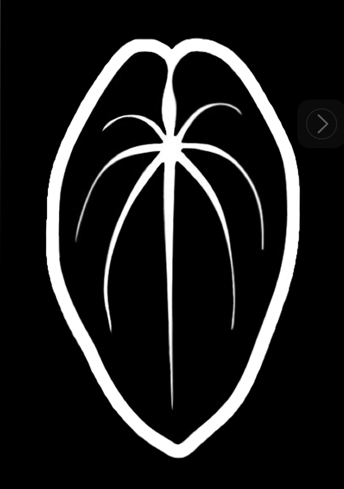
The Story Behind the Anthurium Story Logo
When you receive one of our boxes, you’ll notice something simple: no flashy names, no frills just the logo. That’s intentional. The logo is more than a mark; it’s a symbol of what we stand for and the values that grow alongside every Anthurium we raise.
At the heart of the design is an asymmetrical shape. To some, it might look imperfect. To us, that’s exactly the point. Anthuriums, no matter how stunning, always carry small quirks and unique features. Even the most beautiful, seemingly flawless leaf reveals tiny imperfections when you look closely. Those details are what make each plant alive, authentic, and irreplaceable. Our logo reflects this truth: real beauty lies not in perfection, but in character.
Beyond its form, the logo is meant to represent love for the reward of a well-grown Anthurium, and for the time, care, and energy poured into each leaf. Every curve and angle in the logo carries a reminder that quality comes from patience, authenticity, and attention to detail. When you see it, we want you to feel the same good energy that fills our growing space every morning a sense of calm, connection, and pride in nurturing something living.
From a branding perspective, the logo is our signature of authenticity. It tells you that what’s inside has been grown with respect for nature, intention in breeding, and dedication to excellence. It’s unmistakable because it stands for more than just a name it represents a philosophy.
The Anthurium Story logo is a promise of quality, of care, and of the quiet joy that comes with cultivating something alive. When you see it, we hope you don’t just see a brand you feel the energy and love we’ve put into every leaf